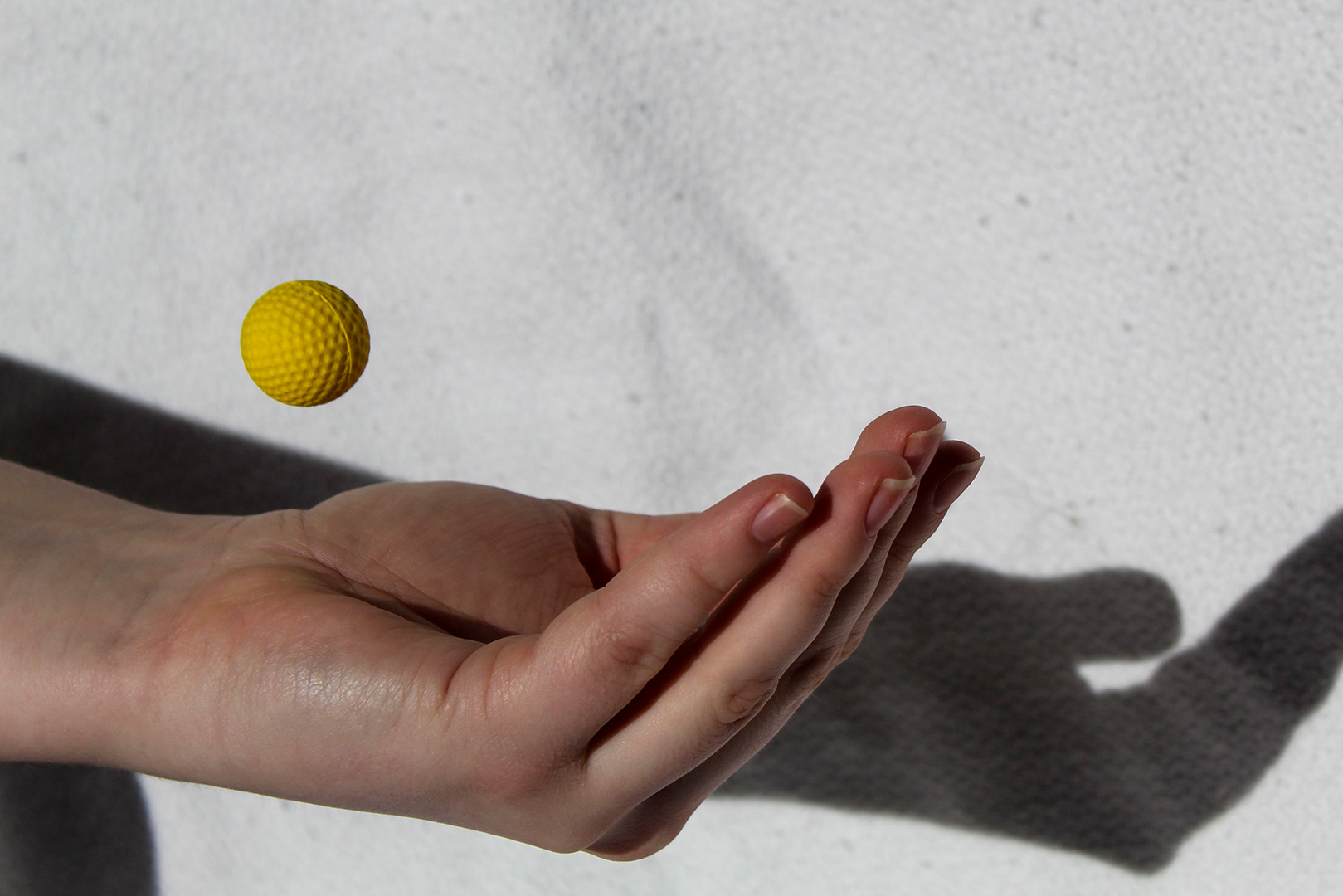
With a fast shutter speed you can freeze objects in place without a blur. I took this photo at my apartment at about 1:30 PM with my Canon Rebel T6. The ISO is 100 with an f-stop of 5.6, a focal length of 55mm, and a shutter speed of 1/1000. I had my roommate throw the ball in the air and try and catch it.
Pen
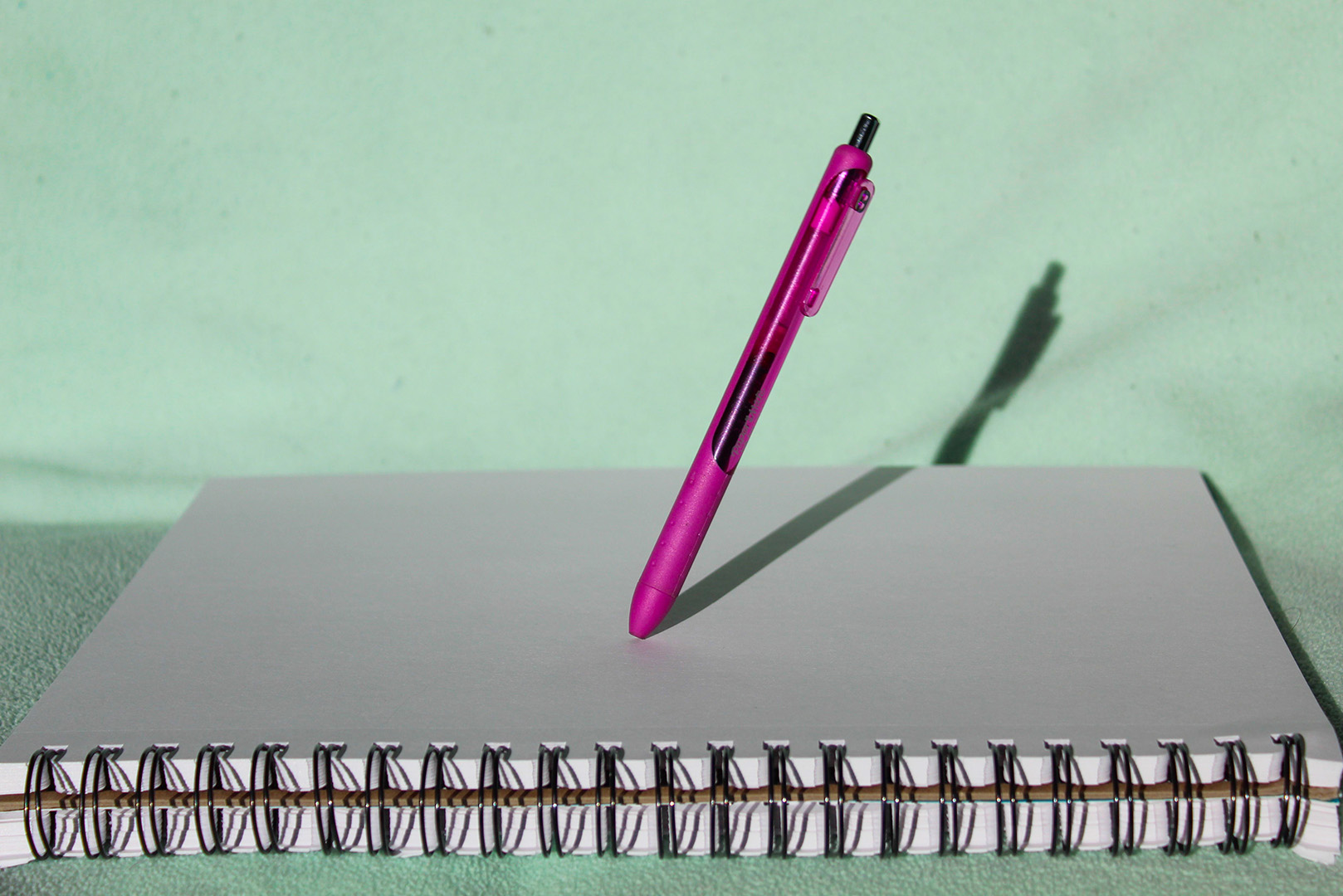
I took this photo in my apartment at 1:30 PM on my Canon Rebel T6 with a focal length of 55mm. The ISO in this photo was 100, an f-stop of 5.6, and a shutter speed of 1/1000. This photo was a lot easier to take than the ball one. I think it’s because I got the hang of the shutter speed a lot better. It was very cool to see the pen stick still like this, compared to how fast it drops.
Slow Shutter Speed
Blanket
This is a photo of a blanket being dropped. I took it in my apartment at 1:45 PM with my Canon Rebel T6 at a focal length of 32mm. My ISO was set at 3200, with an f/14 f-stop, and 1/4 shutter speed. The slow shutter speed really got the blur when the blanket fell.
Quarter
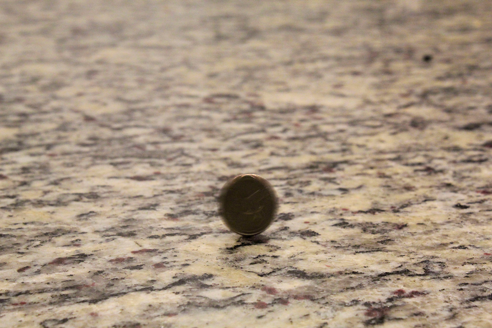
This is a shot of a quarter that I took. This is in my kitchen at 1:54 PM. I took it on my Canon Rebel T6 with a focal length of 55mm. My ISO was set to 3200, my f-stop was set to 10, and my shutter speed was 1/40. The shutter speed is a little faster than recommended because I wanted people to be able to see what the blur was, but still have a motion blur at the same time.
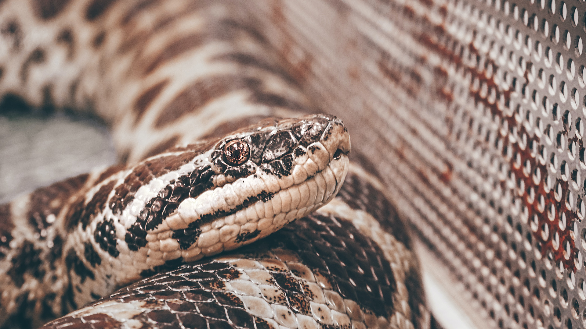
Wide aperture happens when you have a large f-stop. This means that your camera lens is more open and allows more light to come through. What is the result? Your background is blurry, and your subject is in focus. The picture above shows a snake in the foreground very much in focus, but the background is blurred. This is an example of “wide aperture”.
Narrow Aperture
If wide aperture means a large f-stop, then narrow aperture is the opposite. Narrow aperture has a small f-stop, which means that the lens is more closed. This results in everything being sharp. In the photo above, you can see that the lamps in the foreground and the ones in the background are all in focus. There is no blur.
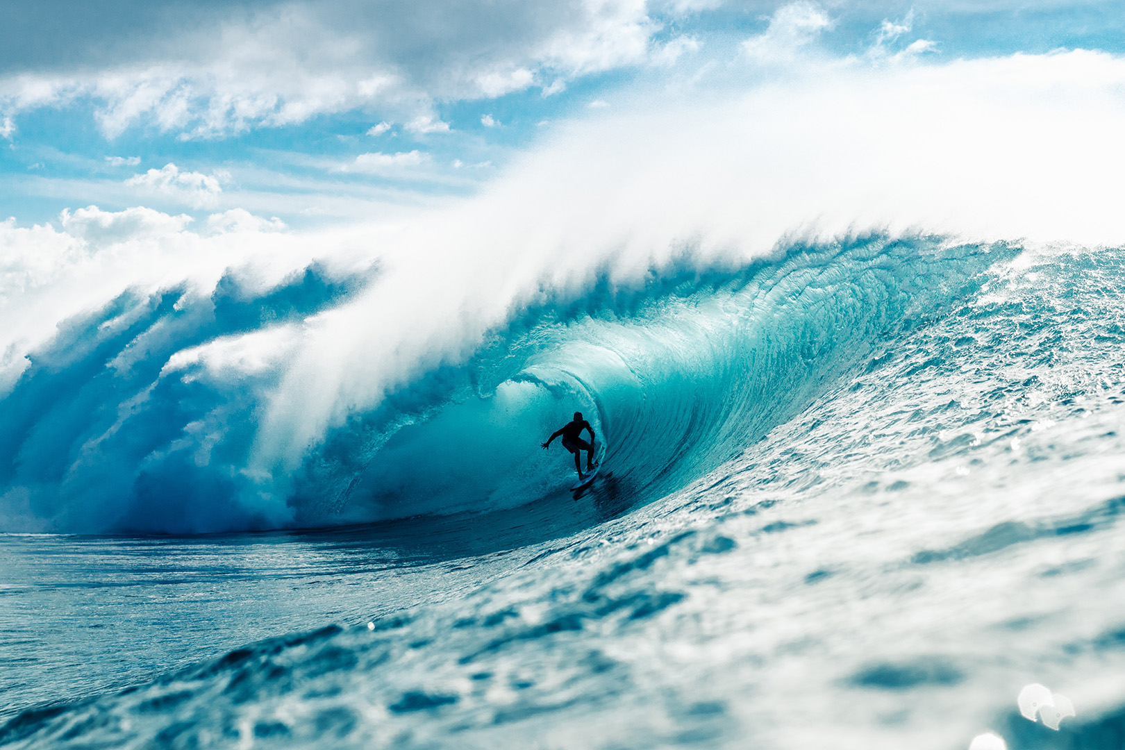
Fast Shutter Speed
Having a higher (faster) shutter speed allows you to photograph things in motion with no blur. With a fast shutter speed you’re able to hold the camera yourself and get many different angles of pictures. The photo above is an example of fast shutter speed because the surfer is caught still with no motion, as well as the wave.
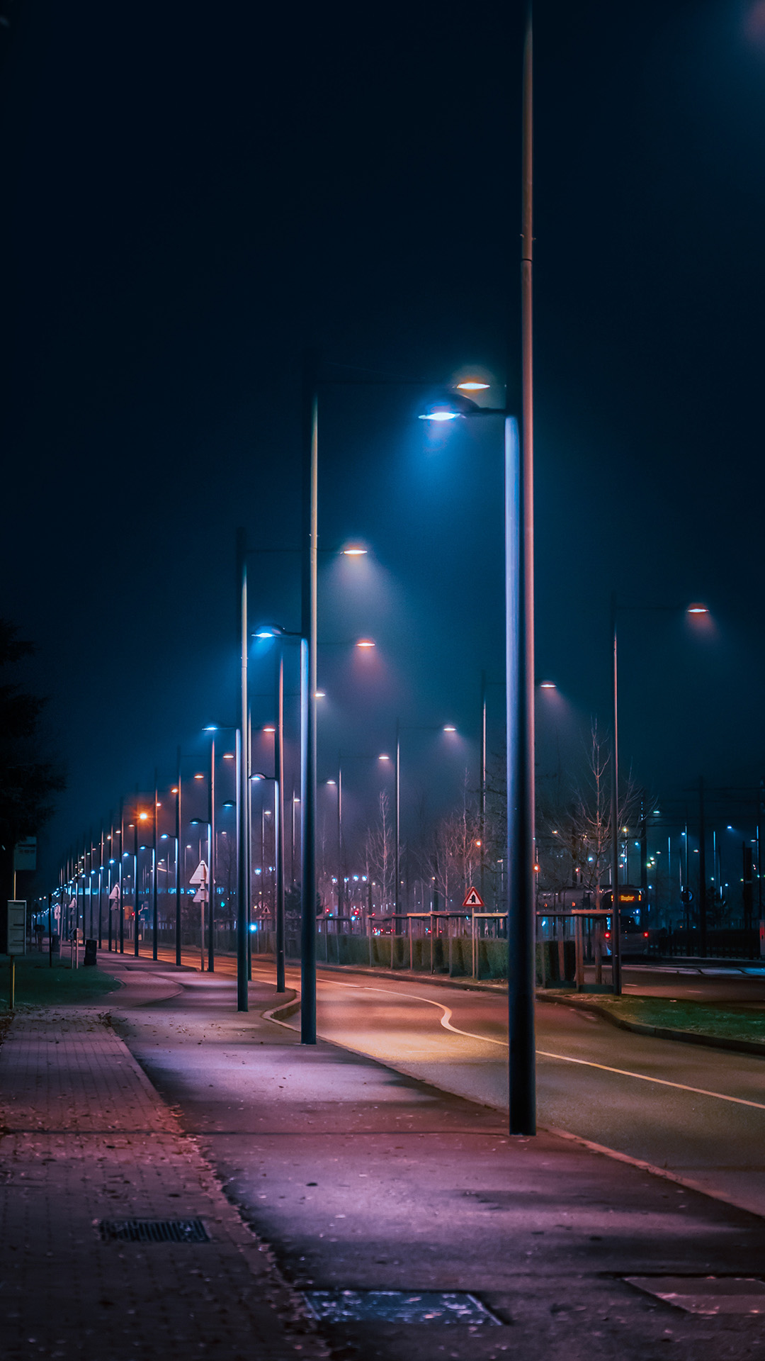
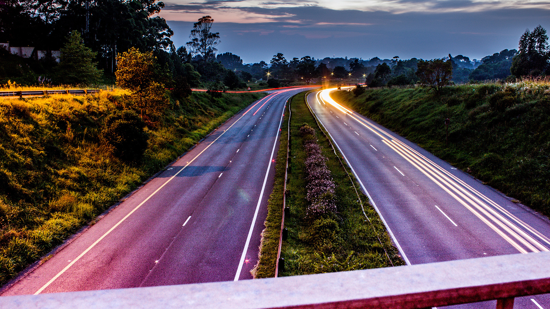
Slow Shutter Speed
A slow shutter speed is used when you want your still images to be sharp, but want moving ones to be blurry. With a slow shutter speed you’ll have to use a tripod or else everything will end up blurry. The photo above shows a great example of a slow shutter speed. It was taken on a tripod (you can tell because the road and surrounding areas aren’t blurry) and the car headlights are blurred (the motion).
What I’m Interested In
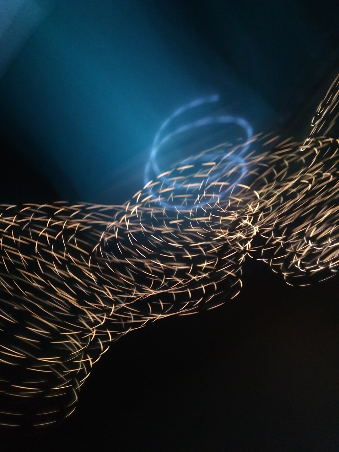
The above image is of a light painting. I’d never seen these until recently, and I think they’re absolutely mesmerizing. I’m intrigued by these because I want to know how to do it! From what I’ve learned, the aperture should be more narrow than wide. This is to allow the light to be sharp in the photo.
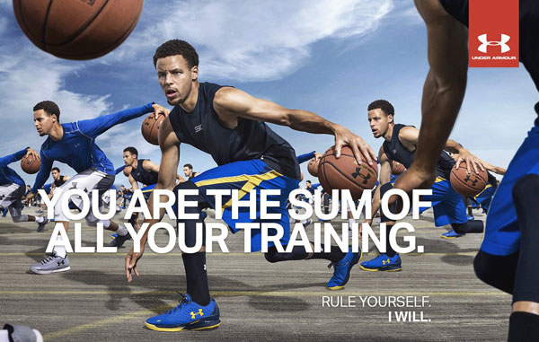
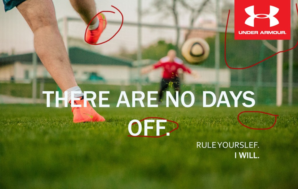
The ad was found on brandchannel.com. This website puts up ads for companies that want their ads put up. Nothing was said about the photographer. The photo is of Stephen Curry.
Original Ad
Design
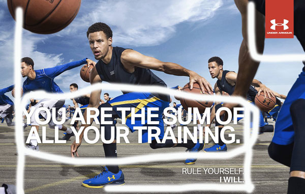
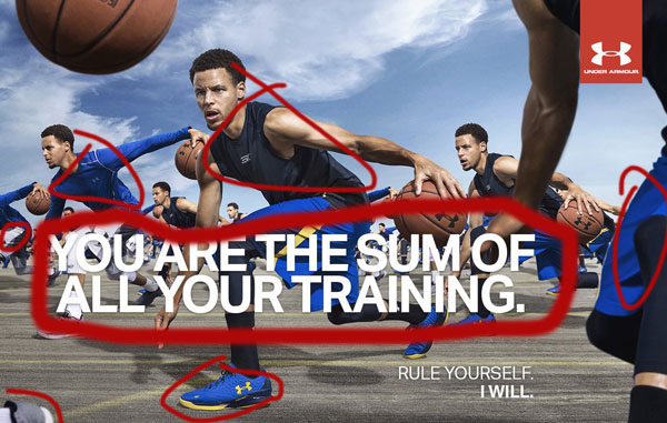
The alignment of the main message is shown to be left aligned. The smaller words below the bigger ones are aligned with the end of the big phrase. The logo is in the top right corner and is bright red to contrast anything else in the ad. The font size is different, giving the appearance that the bigger words are more important. The coloring of the words is white, to make it stick out. You can see the proximity of the two phrases on the bottom, it shows that they are correlated together. The logo on top is farthest from any of the words because it doesn’t mix with it exactly.
Color
The color of the words contrasts with the colors of the shorts to make it pop. The shorts and shirts change color throughout the ad as well.
Typography
The letters don’t have any serifs on them, so the typography would be classified as a sanserif. Same goes for the logo at the top. You can also tell it’s sanserif by the consistency of thickness throughout the letters.
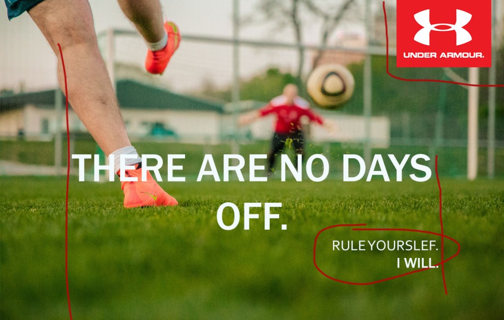
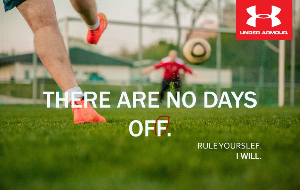
New Ad
Design
The bigger text and the smaller text are aligned. The Under Armour logo is in the upper right hand corner. The text bigger text is center aligned. The smaller texts are right next to each other showing a relationship between the words. The bigger text is close, but far enough away to show a disconnect. The logo is far enough away to show that it is a part of the ad, but not a part of the text. The white text contrasts with the background. There is repetition with the font.
Color
The white color of the text contrasts with the vibrant green of the grass. The Under Armour logo contrasts with the background to make it pop. The vibrant pink of the shoes makes it pop from the sky.
Typography
The letters don’t have any serifs, which makes it a sanserif typography. The Under Armour logo doesn’t have any serifs either.
Conclusion
The original and new ad work together for the same campaign because they have the same typography, design, and color. The white lettering makes the phrases pop from the background. They both have the same red Under Armour logo. The contrast between the phrase “Rule Yourself” and the other words is the same.
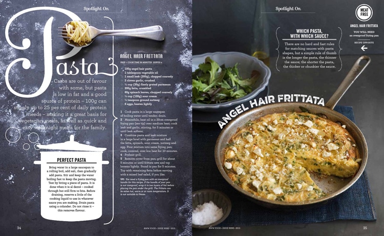
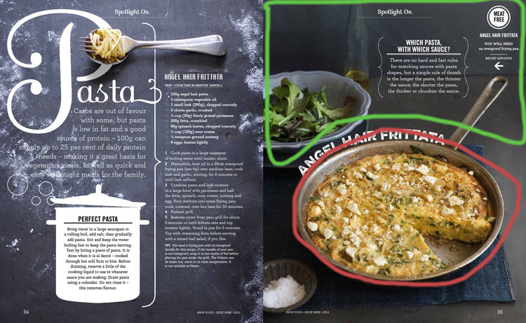
This design was made by Hieu Nguyen for Aww Food. Aww Food is a section in a magazine in Australia’s Women’s Weekly Magazine. Hieu Nguyen has her own website and is an art director in New York.
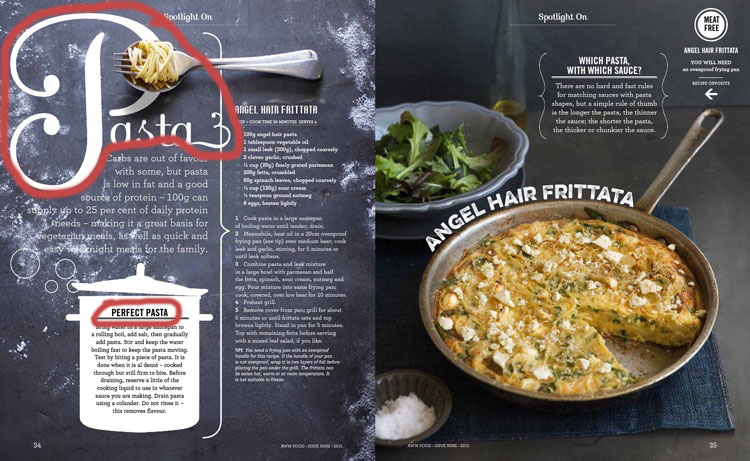
Category Identification
The first typography that is circled is called script. Script is identified by the handwritten look it has in its letters. The second circled portion is identified as sans serif. You can tell when a certain typeface is sans serif because there aren’t any serifs on the edge of the letters.
Typeface Contrast
The first “p” is a script design and you can tell by the flowing look of the letters. The second “p” is a sans serif design which means that there aren’t any serifs on the letters. The difference between script and sans serif is noticeable because script has more curly lettering while sans serif is the same strokes all the way through the letters.
Photography
The type of photography used in this picture is depth of field. Depth of field deals with the foreground and background of a picture. Normally one or the other is blurred making it shallow or deep depth of field. This picture shows an example of a shallow depth of field. We can tell this because the object circled in red isn’t blurred at all while everything in green is starting to be blurred.
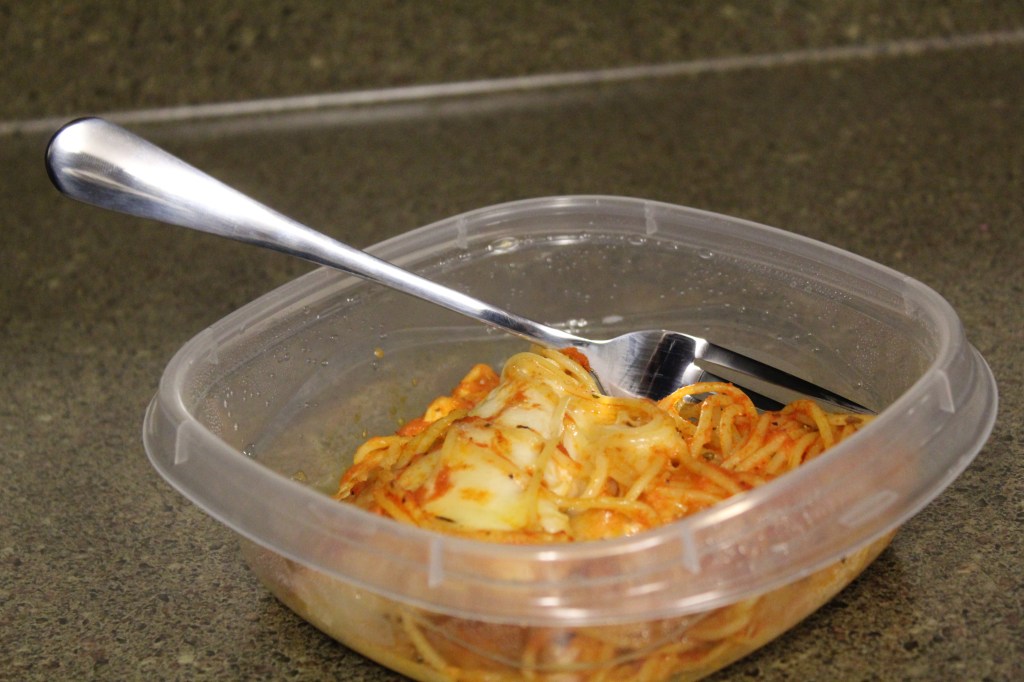
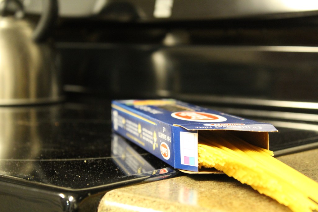
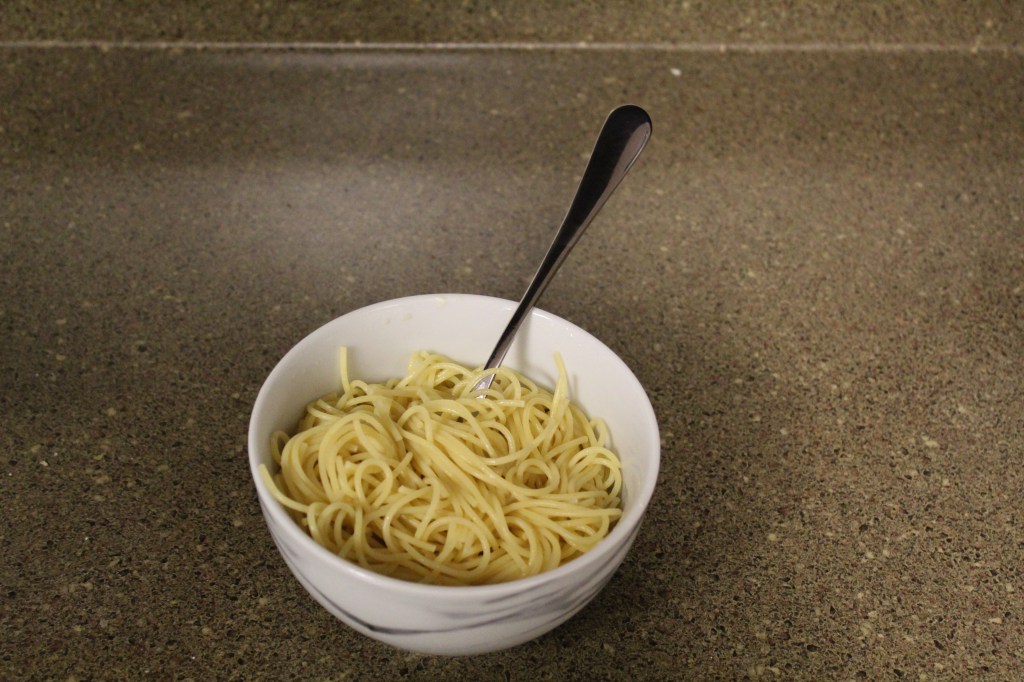
Alternate Images
All of these could be put in place of the of the image in the magazine since they are all some type of pasta. All of the photos also have the depth of field like the magazine photo. The depth of field is shallow based, with the pasta in focus and the background out of focus.
Conclusion
The script typography draw your eyes there first which where they should go since it is the title. The sans serif typography works for the body portion of the text because it is easy to read. The photography puts the most important information in the front while putting the things that aren’t as important in the back. For example, the article is about pasta and has a recipe for one. The picture shows the pasta in the forefront and in focus while the salad is the slightly blurred in the background.
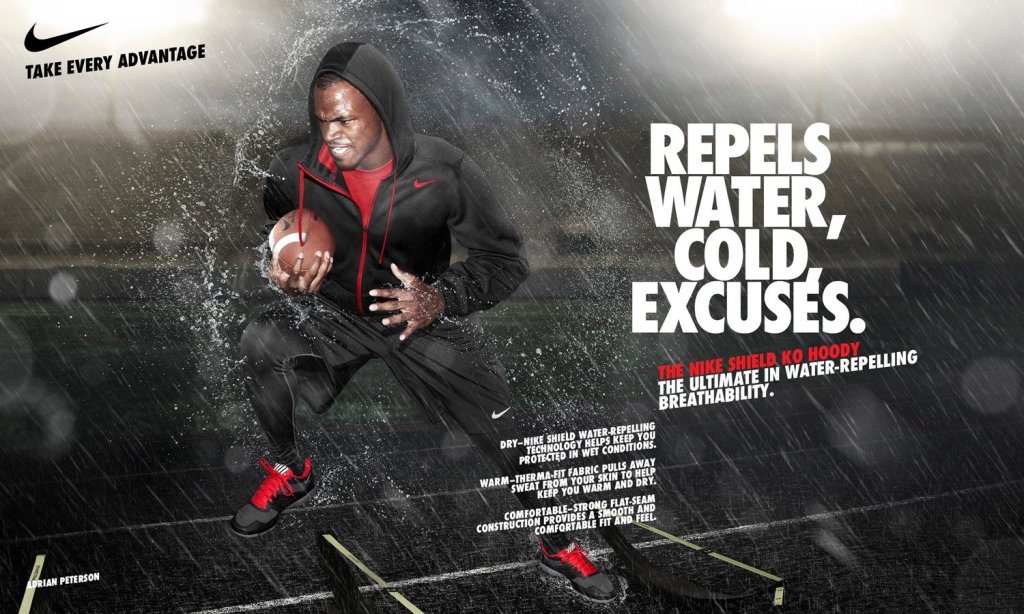
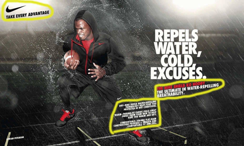
Reverse Engineer Posts are helpful to analyze certain aspects like contrast, repetition, proximity, color, and alignment. This advertisement was created by Kris Seymour who works for Nemo Design.
Contrast
The main contrast we see in this ad is with color and size of font. The color scheme deals mainly with white and blacks and the occasional red. The red contrasts with the rest of the ad, you see it pop right off the screen and it grabs your attention. The font also has contrasts. The biggest font towards the left draws your eyes first, indicating that it’s the most important part of the ad.
Repetition
We see the repetition in the color and the size of font again. The main color scheme is black, white, and red. The red writing in the second block corresponds with the type of hoodie being worn in the picture. The repetition of the color red shows a connection with the writing and the hoodie and shoes. There is more repetition with the Nike symbol on all the clothing, the football, and the logo. The Nike swoosh is noticeable even if the size is super small, like it is in this ad.
Alignment
This ad shows a lot of alignment. We see the big block of letters align with the pinkie finger of Adrian’s hand. The medium sized block of words also lines with the ends of the smallest block of words. The words at the top of the page are aligned with the top of Adrian’s head as well. The bottom of the medium block lines up with the top of the small block of the words. The alignment of the medium and small block show a connection, and there is one. The medium block mentions the hoodie and the small block goes into a deep dive of the hoodie.
Proximity
Proximity shows a relationship with things that are closer together compared to things that are farther apart. You can see that the smallest block of words and paragraphs show a relationship with one another because they are so close together. In the top left corner the Nike sign with the words, “Take every advantage”. You can see that the logo and small phrase is very far away from all of the other words showing that what was written on the right side doesn’t necessarily go with what’s written on the left side.
Color
As said earlier, there are three main colors in this ad. There is red, white, and black. There is some gray in the background as well, but it’s mainly the three colors said in the previous sentence. Red is the main color that’s trying to be shown. The hoodie name is in red and the hoodie itself has red in it. The black and white coloring is supposed to help make the red pop right off the ad and capture our eyes, which it does.
Final Thoughts
The alignment, contrast, color, proximity, and repetition work in a way to make the ad pop in its own way. The ad shows football player Adrian Peterson with a Nike hoodie and a football. The ad shows the use of the Nike Shield KO Hoodie. One line is colored red in the text and that corresponds with the red on the hoodie and shoes. The alignment shows a cohesion from the picture to the words. The proximity of the words on the ad shows what’s most important and what goes together rather than having information on random parts of the ad. The cohesion makes the ad pop and draw your eyes to the ad.
This is the first post on my new blog. I’m just getting this new blog going, so stay tuned for more. Subscribe below to get notified when I post new updates.
This is an example post, originally published as part of Blogging University. Enroll in one of our ten programs, and start your blog right.
You’re going to publish a post today. Don’t worry about how your blog looks. Don’t worry if you haven’t given it a name yet, or you’re feeling overwhelmed. Just click the “New Post” button, and tell us why you’re here.
Why do this?
Because it gives new readers context. What are you about? Why should they read your blog?
Because it will help you focus you own ideas about your blog and what you’d like to do with it.
The post can be short or long, a personal intro to your life or a bloggy mission statement, a manifesto for the future or a simple outline of your the types of things you hope to publish.
To help you get started, here are a few questions:
Why are you blogging publicly, rather than keeping a personal journal?
What topics do you think you’ll write about?
Who would you love to connect with via your blog?
If you blog successfully throughout the next year, what would you hope to have accomplished?
You’re not locked into any of this; one of the wonderful things about blogs is how they constantly evolve as we learn, grow, and interact with one another — but it’s good to know where and why you started, and articulating your goals may just give you a few other post ideas.
Can’t think how to get started? Just write the first thing that pops into your head. Anne Lamott, author of a book on writing we love, says that you need to give yourself permission to write a “crappy first draft”. Anne makes a great point — just start writing, and worry about editing it later.
When you’re ready to publish, give your post three to five tags that describe your blog’s focus — writing, photography, fiction, parenting, food, cars, movies, sports, whatever. These tags will help others who care about your topics find you in the Reader. Make sure one of the tags is “zerotohero,” so other new bloggers can find you, too.


