Introduction

Link: https://www.cyclopscreativeco.com/nike-athletic-training
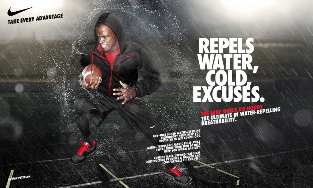
Reverse Engineer Posts are helpful to analyze certain aspects like contrast, repetition, proximity, color, and alignment. This advertisement was created by Kris Seymour who works for Nemo Design.
Contrast
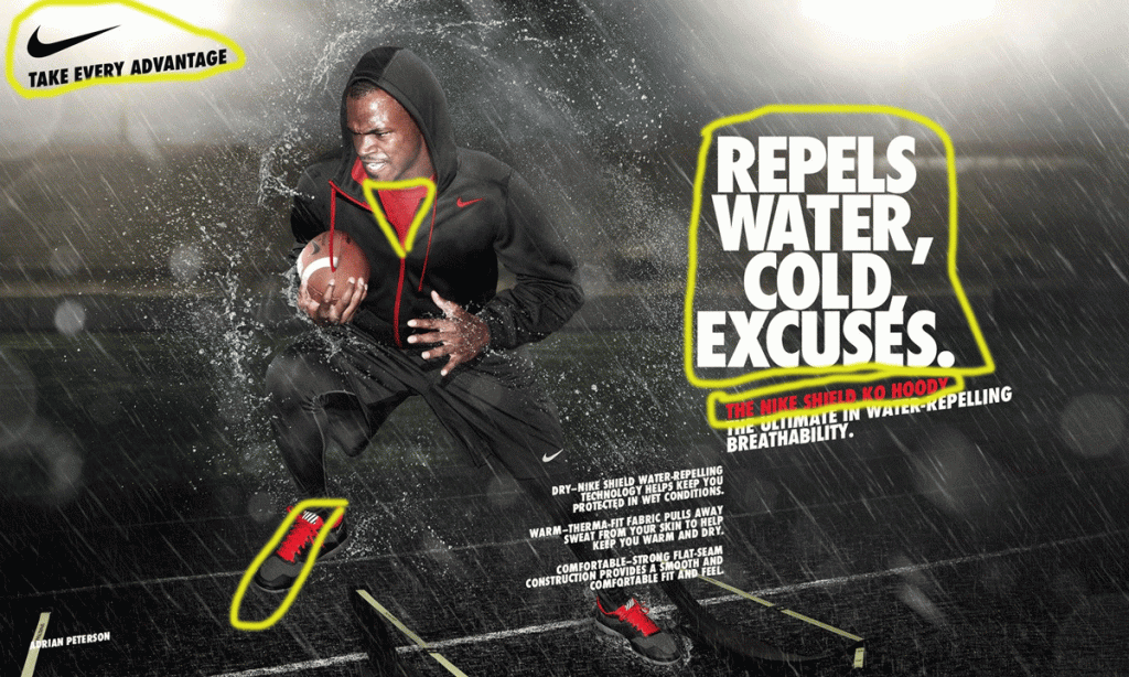
The main contrast we see in this ad is with color and size of font. The color scheme deals mainly with white and blacks and the occasional red. The red contrasts with the rest of the ad, you see it pop right off the screen and it grabs your attention. The font also has contrasts. The biggest font towards the left draws your eyes first, indicating that it’s the most important part of the ad.
Repetition
We see the repetition in the color and the size of font again. The main color scheme is black, white, and red. The red writing in the second block corresponds with the type of hoodie being worn in the picture. The repetition of the color red shows a connection with the writing and the hoodie and shoes. There is more repetition with the Nike symbol on all the clothing, the football, and the logo. The Nike swoosh is noticeable even if the size is super small, like it is in this ad.
Alignment
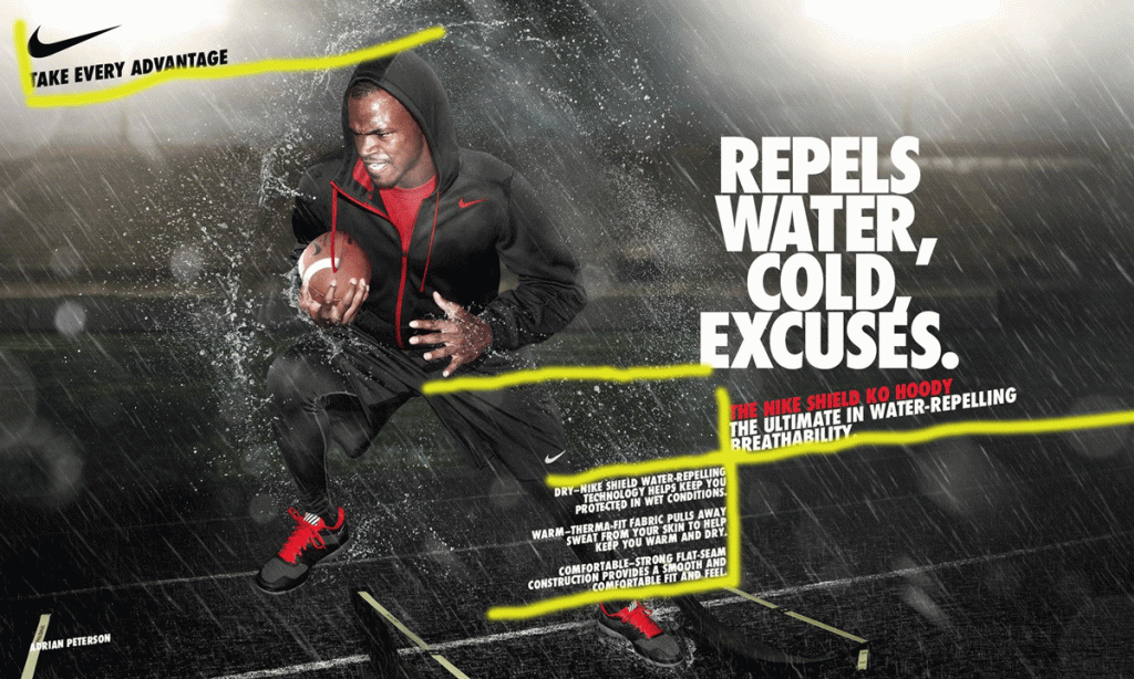
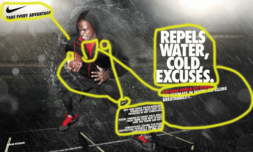
This ad shows a lot of alignment. We see the big block of letters align with the pinkie finger of Adrian’s hand. The medium sized block of words also lines with the ends of the smallest block of words. The words at the top of the page are aligned with the top of Adrian’s head as well. The bottom of the medium block lines up with the top of the small block of the words. The alignment of the medium and small block show a connection, and there is one. The medium block mentions the hoodie and the small block goes into a deep dive of the hoodie.
Proximity
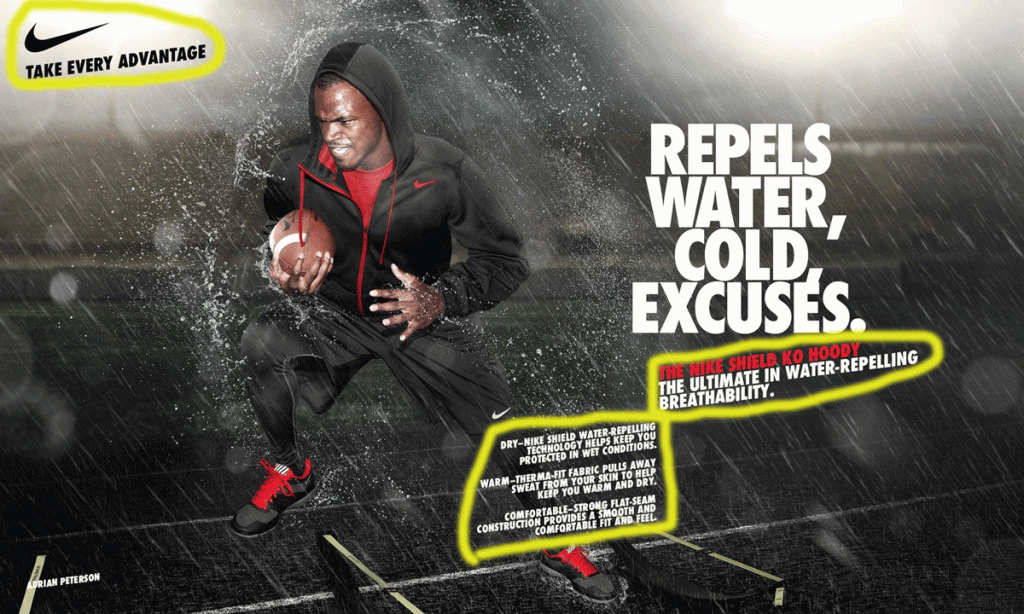
Proximity shows a relationship with things that are closer together compared to things that are farther apart. You can see that the smallest block of words and paragraphs show a relationship with one another because they are so close together. In the top left corner the Nike sign with the words, “Take every advantage”. You can see that the logo and small phrase is very far away from all of the other words showing that what was written on the right side doesn’t necessarily go with what’s written on the left side.
Color
As said earlier, there are three main colors in this ad. There is red, white, and black. There is some gray in the background as well, but it’s mainly the three colors said in the previous sentence. Red is the main color that’s trying to be shown. The hoodie name is in red and the hoodie itself has red in it. The black and white coloring is supposed to help make the red pop right off the ad and capture our eyes, which it does.
Final Thoughts
The alignment, contrast, color, proximity, and repetition work in a way to make the ad pop in its own way. The ad shows football player Adrian Peterson with a Nike hoodie and a football. The ad shows the use of the Nike Shield KO Hoodie. One line is colored red in the text and that corresponds with the red on the hoodie and shoes. The alignment shows a cohesion from the picture to the words. The proximity of the words on the ad shows what’s most important and what goes together rather than having information on random parts of the ad. The cohesion makes the ad pop and draw your eyes to the ad.
