Introduction
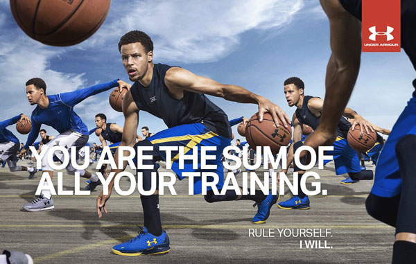
The ad was found on brandchannel.com. This website puts up ads for companies that want their ads put up. Nothing was said about the photographer. The photo is of Stephen Curry.
Original Ad
Design
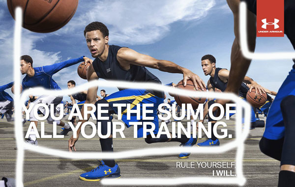
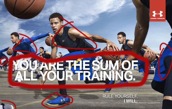
The alignment of the main message is shown to be left aligned. The smaller words below the bigger ones are aligned with the end of the big phrase. The logo is in the top right corner and is bright red to contrast anything else in the ad. The font size is different, giving the appearance that the bigger words are more important. The coloring of the words is white, to make it stick out. You can see the proximity of the two phrases on the bottom, it shows that they are correlated together. The logo on top is farthest from any of the words because it doesn’t mix with it exactly.
Color
The color of the words contrasts with the colors of the shorts to make it pop. The shorts and shirts change color throughout the ad as well.
Typography

The letters don’t have any serifs on them, so the typography would be classified as a sanserif. Same goes for the logo at the top. You can also tell it’s sanserif by the consistency of thickness throughout the letters.
New Ad
Design
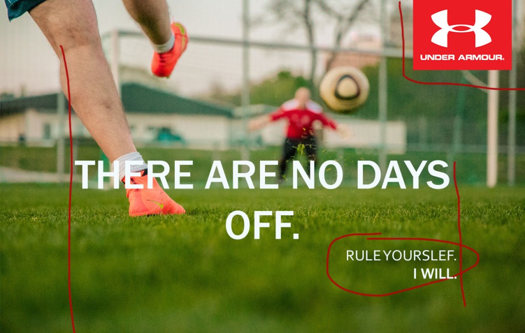
The bigger text and the smaller text are aligned. The Under Armour logo is in the upper right hand corner. The text bigger text is center aligned. The smaller texts are right next to each other showing a relationship between the words. The bigger text is close, but far enough away to show a disconnect. The logo is far enough away to show that it is a part of the ad, but not a part of the text. The white text contrasts with the background. There is repetition with the font.
Color
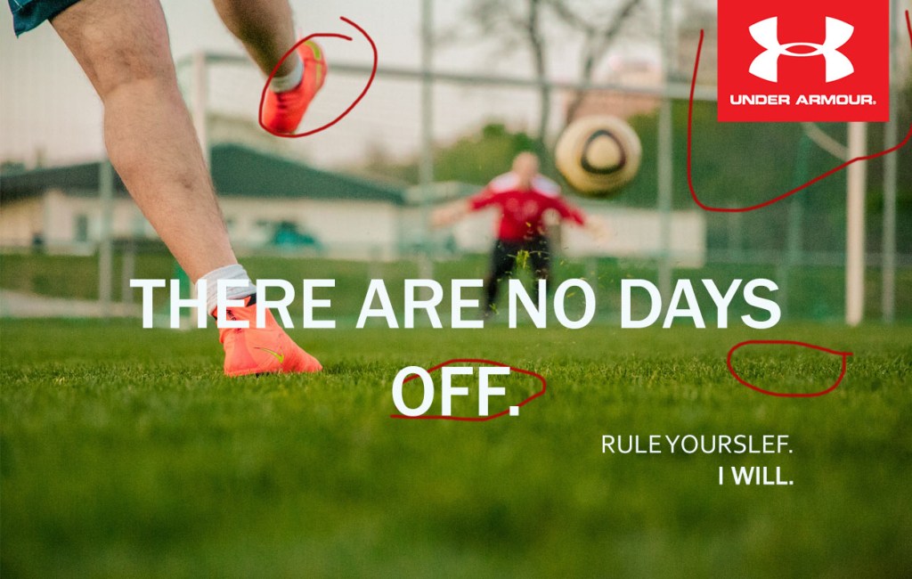
The white color of the text contrasts with the vibrant green of the grass. The Under Armour logo contrasts with the background to make it pop. The vibrant pink of the shoes makes it pop from the sky.
Typography
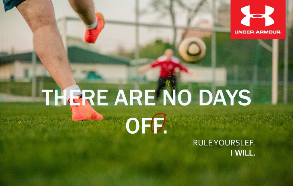
The letters don’t have any serifs, which makes it a sanserif typography. The Under Armour logo doesn’t have any serifs either.
Conclusion
The original and new ad work together for the same campaign because they have the same typography, design, and color. The white lettering makes the phrases pop from the background. They both have the same red Under Armour logo. The contrast between the phrase “Rule Yourself” and the other words is the same.
