Fast Shutter Speed With a fast shutter speed you can freeze objects in place without a blur. I took this photo at my apartment at about 1:30 PM with my Canon Rebel T6. The ISO is 100 with an f-stop of 5.6, a focal length of 55mm, and a shutter speed of 1/1000. I hadContinue reading “Motion – Speed & Blur”
Author Archives: arosenow0
Aperture and Shutter Speed
Wide Aperture Wide aperture happens when you have a large f-stop. This means that your camera lens is more open and allows more light to come through. What is the result? Your background is blurry, and your subject is in focus. The picture above shows a snake in the foreground very much in focus, butContinue reading “Aperture and Shutter Speed”
Under Armour Ads
Introduction The ad was found on brandchannel.com. This website puts up ads for companies that want their ads put up. Nothing was said about the photographer. The photo is of Stephen Curry. Original Ad Design The alignment of the main message is shown to be left aligned. The smaller words below the bigger ones areContinue reading “Under Armour Ads”
Magazine Spread Critique
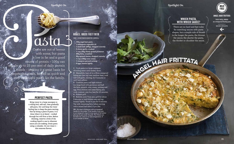
Introduction This design was made by Hieu Nguyen for Aww Food. Aww Food is a section in a magazine in Australia’s Women’s Weekly Magazine. Hieu Nguyen has her own website and is an art director in New York. Category Identification The first typography that is circled is called script. Script is identified by the handwrittenContinue reading “Magazine Spread Critique”
Nike Athletics
Introduction Reverse Engineer Posts are helpful to analyze certain aspects like contrast, repetition, proximity, color, and alignment. This advertisement was created by Kris Seymour who works for Nemo Design. Contrast The main contrast we see in this ad is with color and size of font. The color scheme deals mainly with white and blacks andContinue reading “Nike Athletics”
My First Blog Post
Be yourself; Everyone else is already taken. — Oscar Wilde. This is the first post on my new blog. I’m just getting this new blog going, so stay tuned for more. Subscribe below to get notified when I post new updates.
Introduce Yourself (Example Post)
This is an example post, originally published as part of Blogging University. Enroll in one of our ten programs, and start your blog right. You’re going to publish a post today. Don’t worry about how your blog looks. Don’t worry if you haven’t given it a name yet, or you’re feeling overwhelmed. Just click theContinue reading “Introduce Yourself (Example Post)”
