Over the weekend I was able to go up to Island Park and take a multitude of shots! Here are some of them!
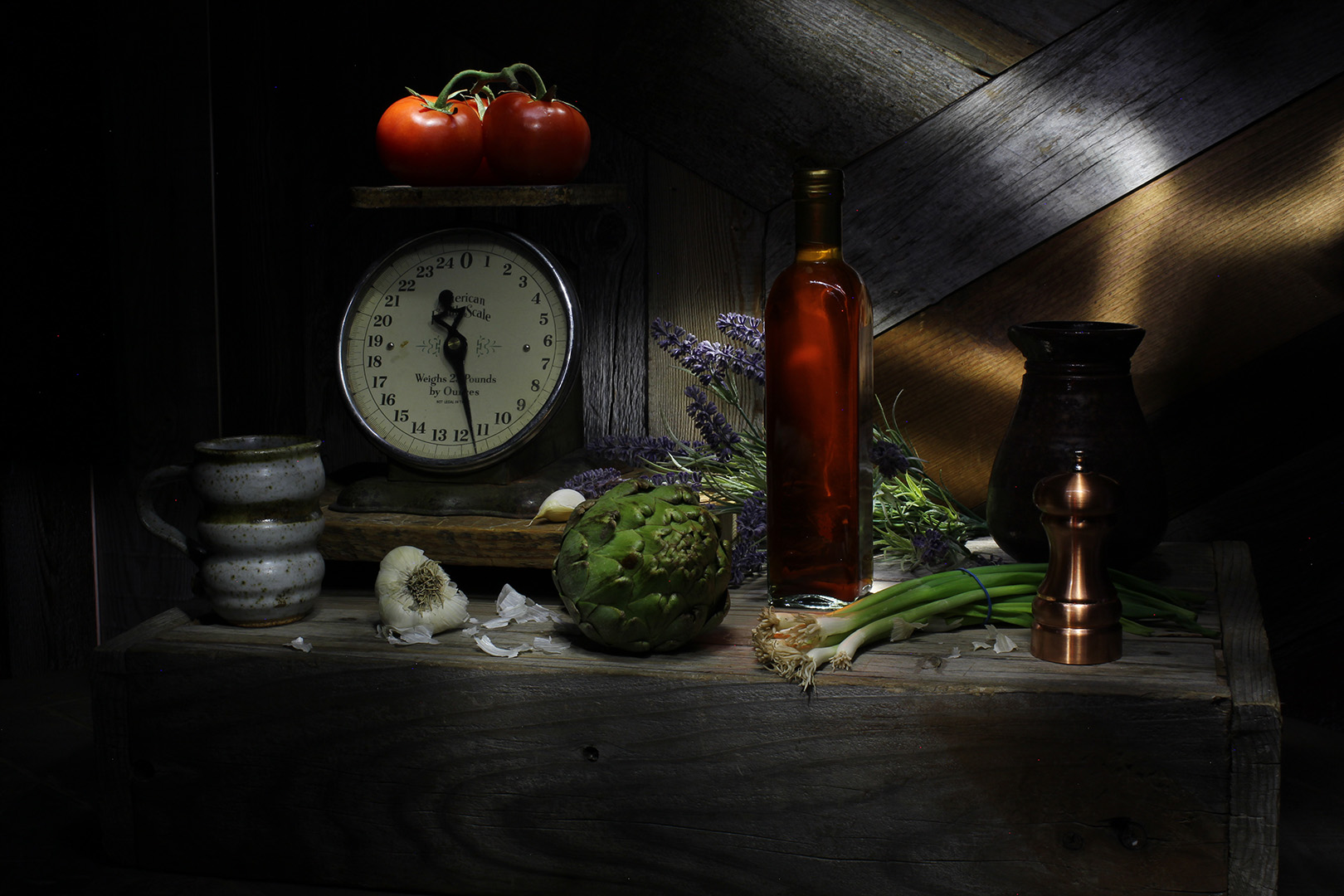
Product
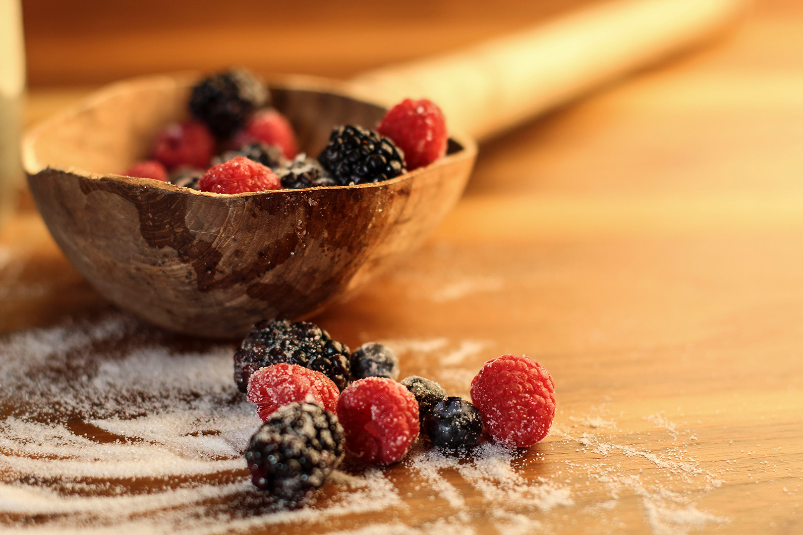
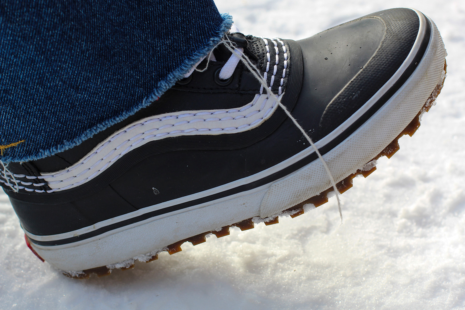
These are two photos I took for “Product Photography”. I really enjoyed the set up of the first shot and loved the warm light. The second shot was nice to take because I had to change my settings from staged indoor lighting to ambient outdoor lighting, which I haven’t done before. It was fun being able to do that and learning what worked best and what didn’t.
Abstract
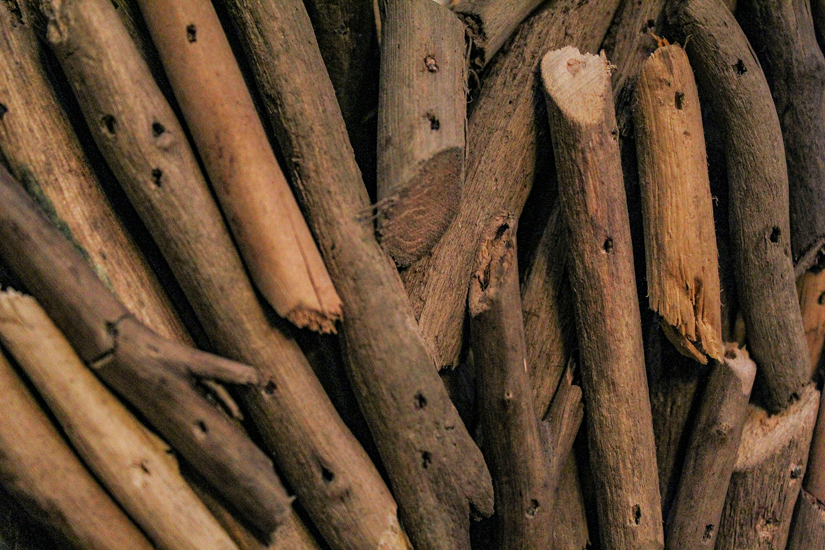
This is a photo of a wooden heart I found in the house. I thought the picture as a close up looked really cool, and almost like a pile of sticks on the ground. Who would know?
Commercial
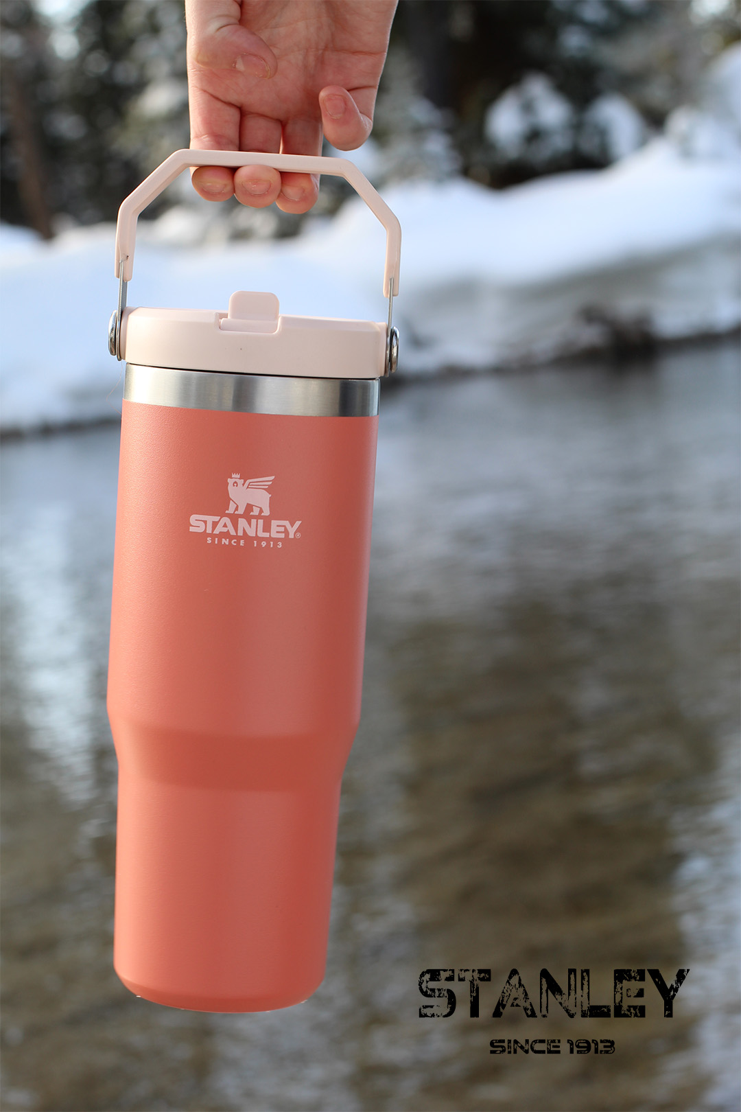
I liked the idea of having a Stanley cup swinging outside and I really loved this picture. Unfortunately for me, I couldn’t find a logo font exactly like the one that is used for the cup, but I did my best with what I could find.
Light Painting
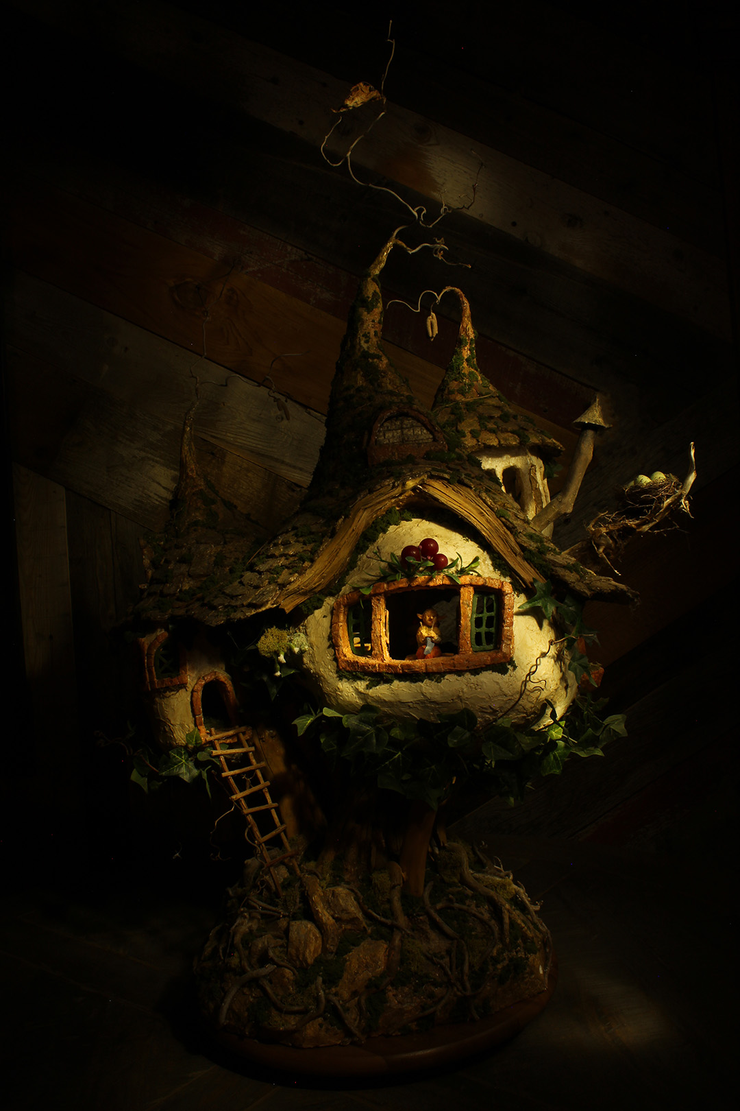
Light painting became a fast favorite for me. I enjoyed trying to make my own shadows with the flashlight and could’ve stayed at this station all day. The first photo I was taking on a warmer white balance, so it would come out looking like the second photo – it had a warmer tone to it. I wanted to try something different so I switched the white balance and it came out bluer, almost clinic looking – which I loved. The second photo was taken of a cute little clay gnome house that I thought would look cool as a light painting. It almost looks like something taken out of a fantasy novel.
